Your cash, one click away: brand identity and a cash-flow platform for the CFO's office, on desktop and mobile.
Context
Cash, forecast and reports lived in different places, and a CFO had to put the picture together by hand. One Click is a financial platform for the CFO's office, by nxty.ai, built so the essential features are one click away.
I created the brand identity and the UX/UI: clarity and trust in the brand, a seamless experience in the product. Through user research and testing we made sure the platform meets different users' needs and makes financial management more accessible.
Decisions
Three decisions shaped it. One grid for the whole year, with actual next to forecast, so a CFO sees what came in, what goes out and what is coming in one calm view.
Every number opens its detail in a side drawer, so nobody leaves the page. And desktop goes deep while mobile goes narrow, both starting from the same cash position.
Design
Login, dashboard, the cash flow grid, future income, expense analytics and reports, all built from the same rules: cobalt for actual, outlined boxes for forecast, totals on a tinted band.
Bank connections that sync themselves, and scenarios that let a CFO move a slider and watch the forecast move with it.
Mobile
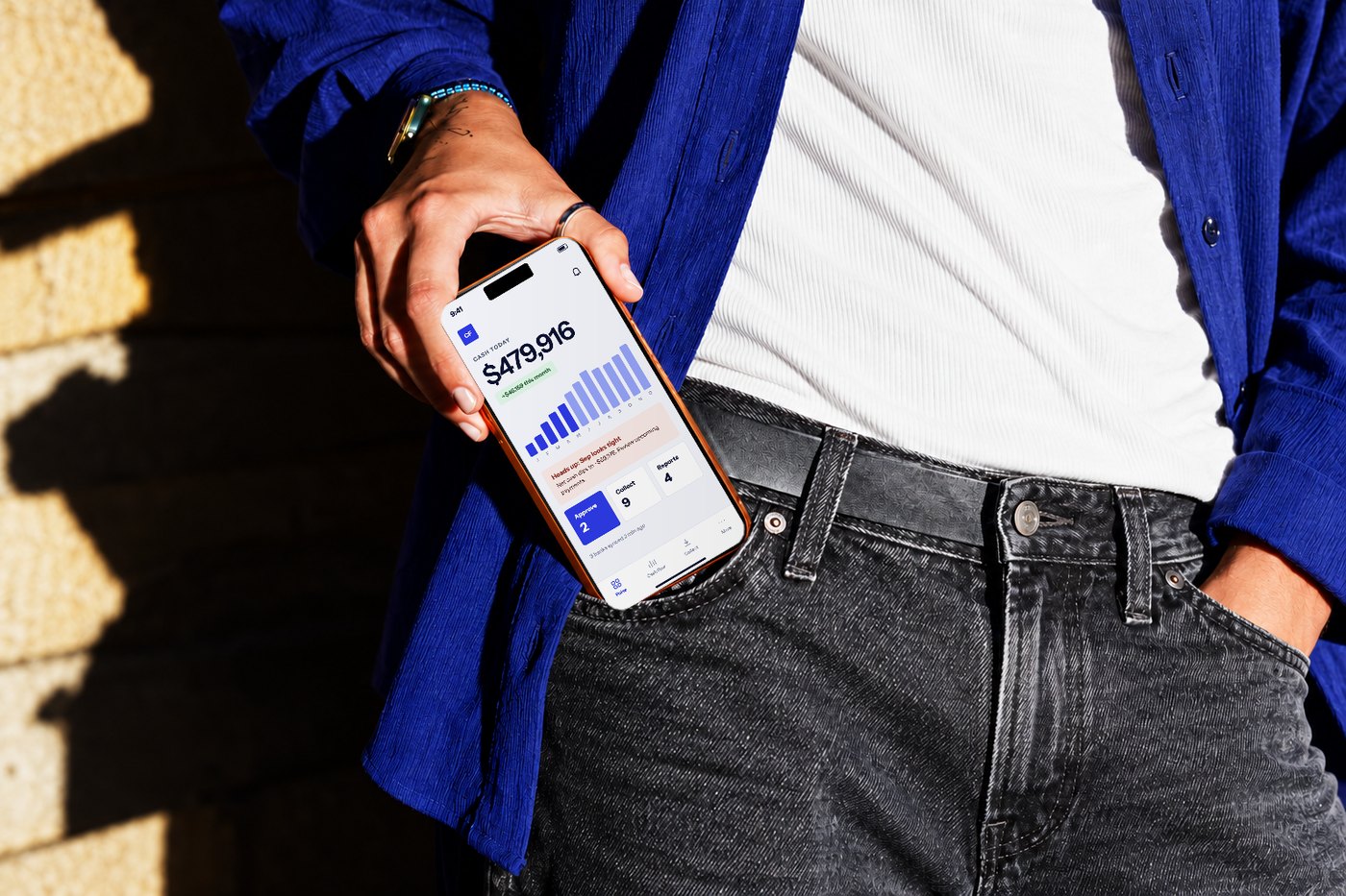
Mobile does not copy the grid. It answers what a CFO asks away from the desk: how much cash, what needs me, can I approve.
Three-step onboarding, one-tap approve, every state designed, and a simple app icon: a tile and a dot, readable at 20 px.
Takeaways
In finance, trust comes from being able to trace every number, from a total down to the receipt, and from a forecast to its assumptions.
Strict, simple rules, like cobalt for actual and outlines for forecast, made a dense product easy to read.